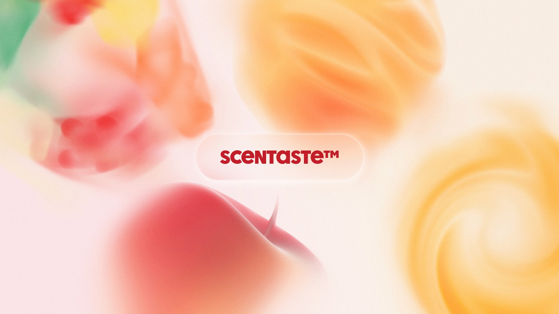
Background
air up® introduced Scentaste™ , a unique naming and visual system designed to express the flavour experience of their scent-based drinking innovation. Each pod’s flavour is experienced through scent, making the taste mild, airy, and subtle. The challenge was to visually represent these understated flavours without overstating their intensity, while still creating memorable, recognisable artwork that reflected each unique profile.
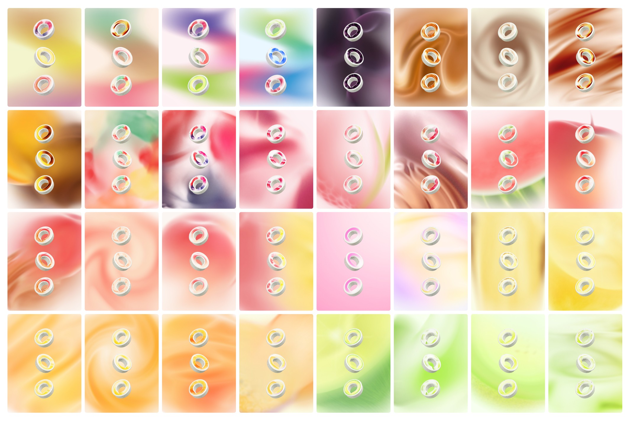
My Approach
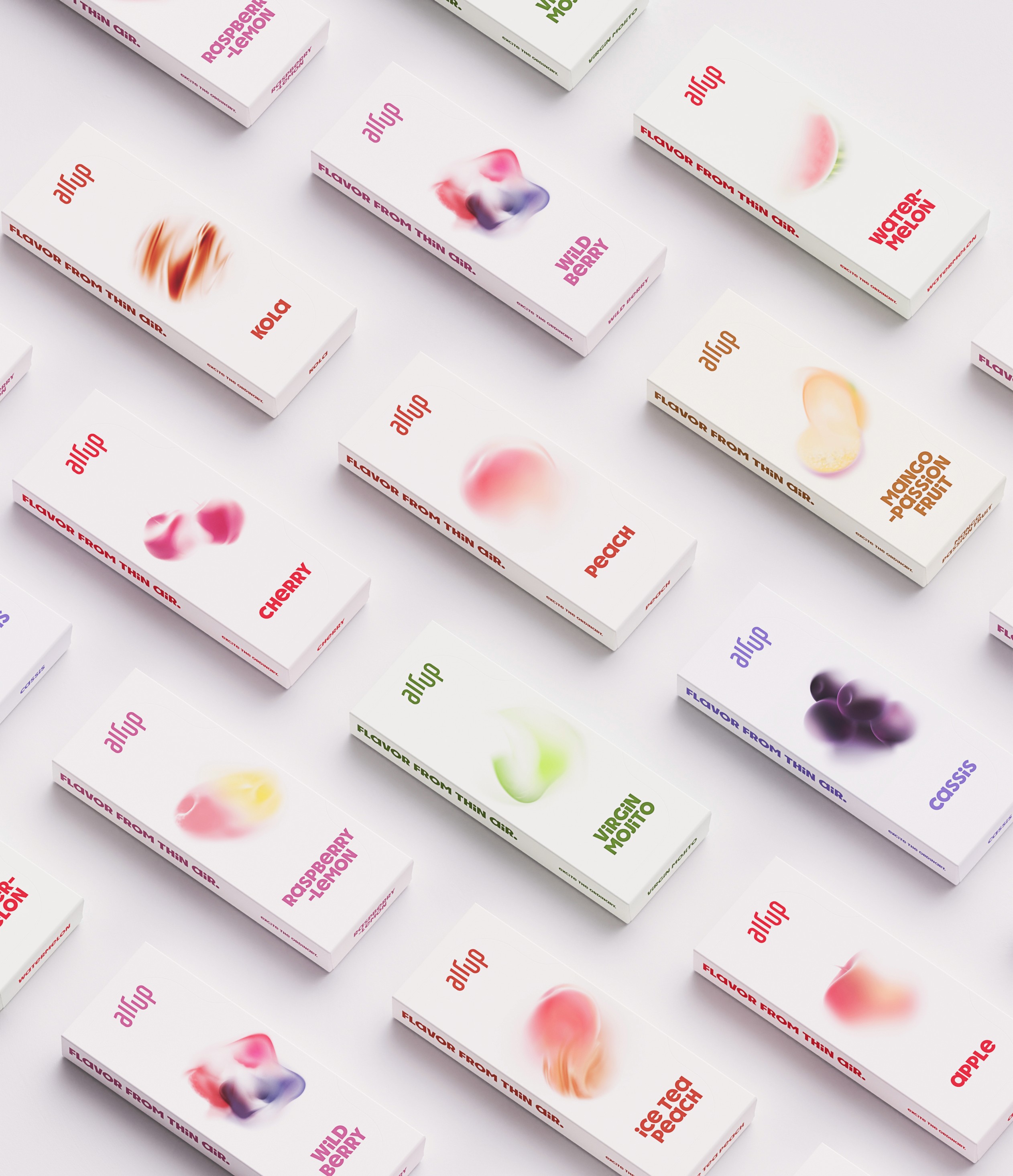
I was given flavour names along with profiles containing mood characteristics like sweetness, intensity, and more specific notes such as “cola candy” or “citrus zest.” From these cues, I developed abstract visualisations that felt like they existed in the air, soft, atmospheric compositions using colour and form to suggest flavour without directly depicting it. These visuals needed to balance between being emotive and clearly distinguishable from one another, despite their abstract nature. They were used across multiple touchpoints: as stickers on the pods, integrated into the website, and printed on packaging.
Result
The final visuals captured the essence of each flavour in a way that felt airy yet identifiable. By leaning into abstraction and subtlety, the artwork supported air up’s unique sensory experience, enhancing the product without overpowering it. Customers now have clearer expectations of the flavours, while still feeling excited to try them.