

Background
When I joined the project at air up®, the existing icon system was inconsistent in both style and sizing. This lack of cohesion disrupted the visual flow across the site and made it harder for developers and designers to maintain a seamless user experience. I was tasked with redesigning the iconography system to improve consistency, usability, and brand alignment.
My Approach
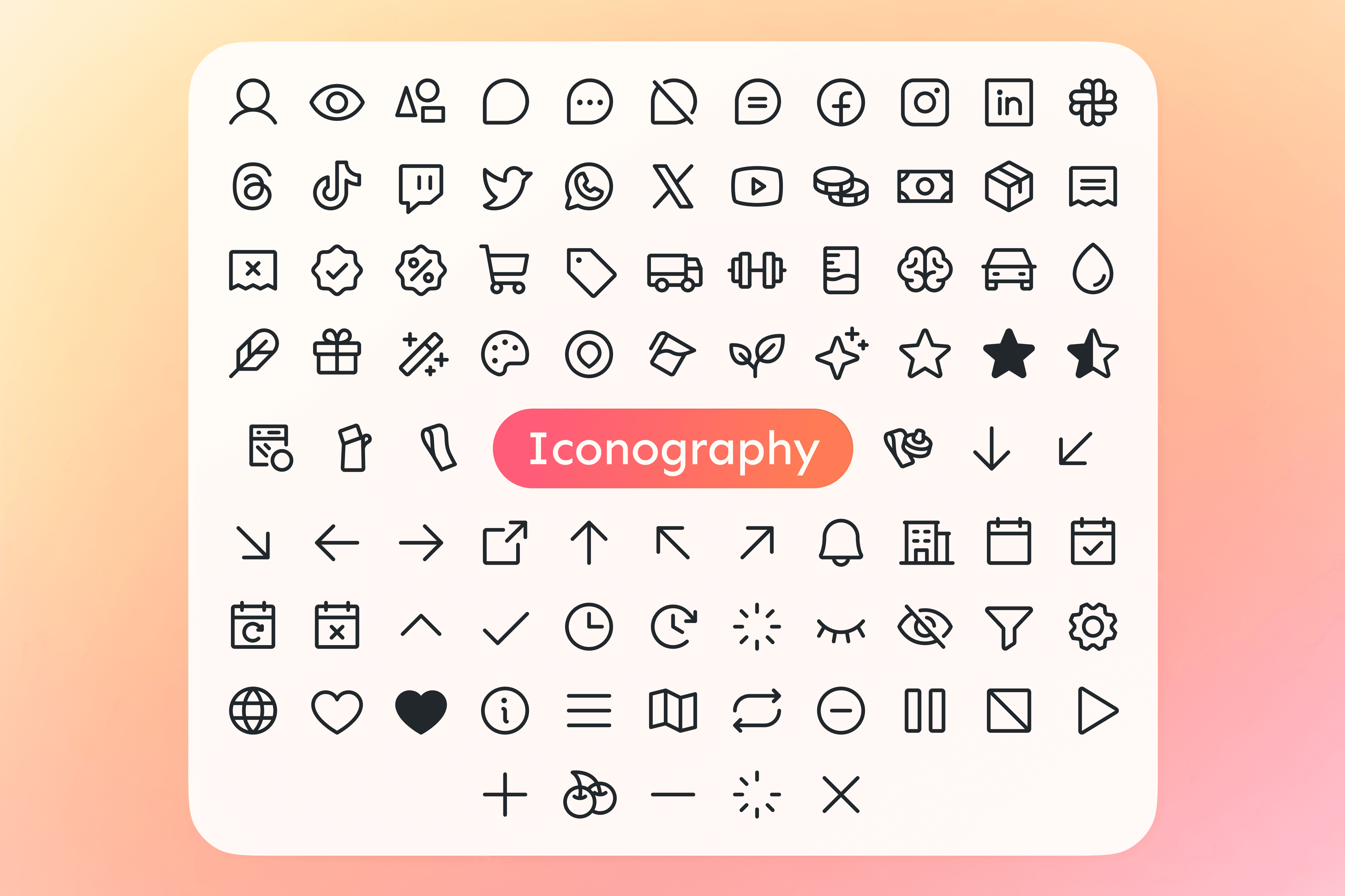
I established a new iconography library tailored to air up’s digital ecosystem. The foundation combined the modern and flexible Phosphor icon set with bespoke custom icons that I created or adapted, such as for pods, bottles, and dishwasher compatibility. These icons were designed specifically for air up’s unique brand language and product range.
Key elements of the approach:
Consistent Sizing
All icons were standardized to Small (16×16), Medium (24×24), and Large (32×32) sizes, based on current usage patterns. Legacy icons are gradually replaced with their proper size or the next larger variant to ensure visual harmony.
Categorization
Icons were organized into five clear categories:
Product
Social
Commerce
Value
Utility
Naming System: I introduced a logical, scalable naming convention to improve discoverability and developer handoff.
Web Optimization: Every icon is optimized for clarity, legibility, and seamless integration into air up’s design system.
The new icon library brings a consistent, cohesive visual language across air up’s digital touchpoints. It not only enhances the aesthetic integrity of the website but also improves user experience through clearer communication and visual rhythm.
Result
Improved UX through consistent visual cues.
Faster development thanks to organized naming and sizing standards.
Brand alignment via bespoke icons tailored to air up’s product ecosystem.
Scalability for use beyond web, including mobile and print.